AKASHDEEP DESIGN STUDIO

UI/UX Design | Architecture Website | 2025

project overview

client

Akashdeep Design Studio

Industry

Architecture & Interior Design

MY ROLE

UI/UX Designer, Visual Designer

TIMELINE

2.5 months

deliverables

Website Design, UI System, Layout Structure

Akashdeep Design Studio wanted to transform their outdated website into a modern, professional, and visually distinctive digital presence. As the brand enters a new era under the next generation, the website needed to showcase their architectural expertise while reflecting a renewed identity rooted in heritage, innovation, and contemporary design.

My goal was to craft a visually expressive product with unique layout structures, varied design thinking, and animation-driven interactions — all aligned with the client’s vision of standing out in a competitive design industry.

client context

About the client

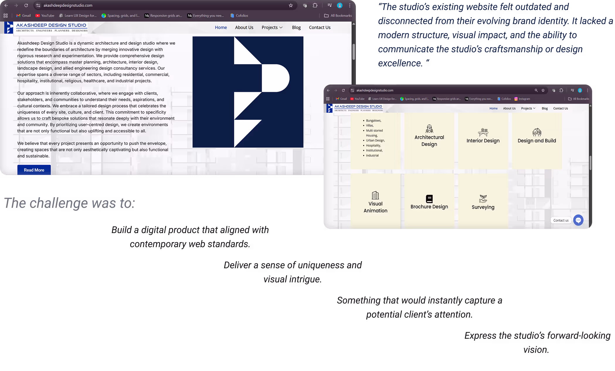
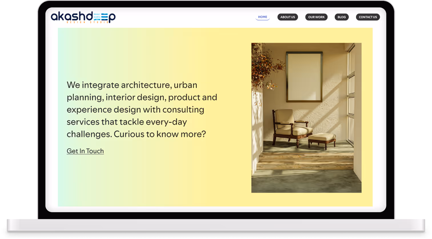
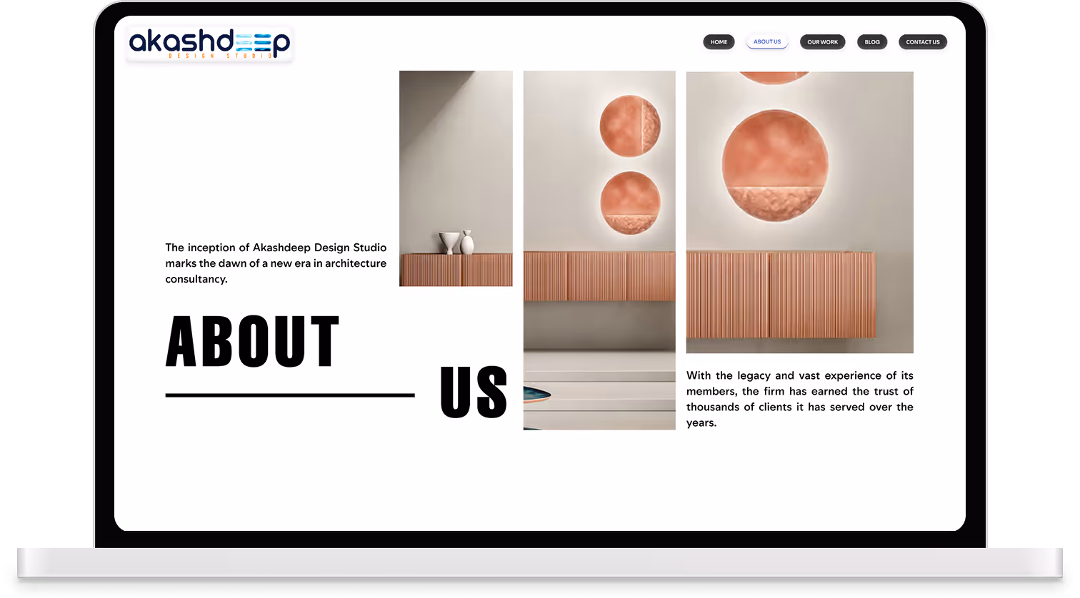
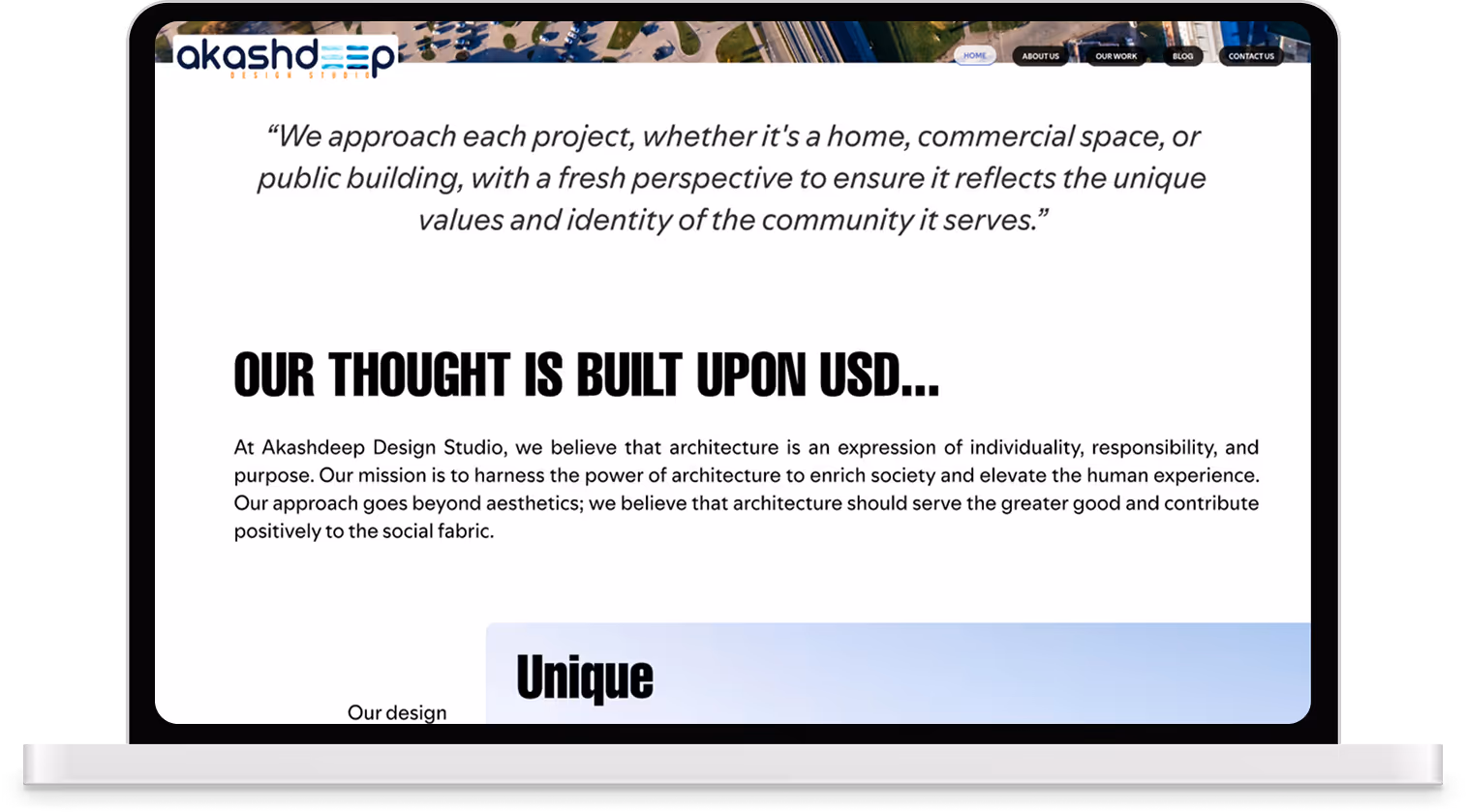
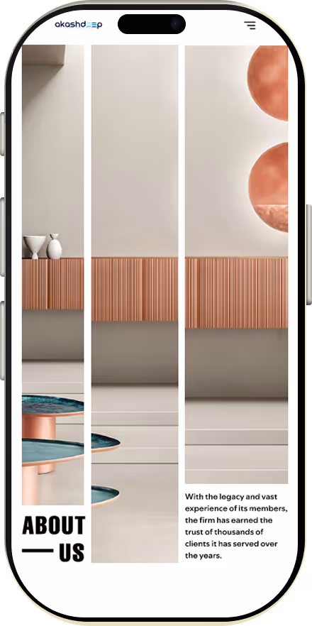
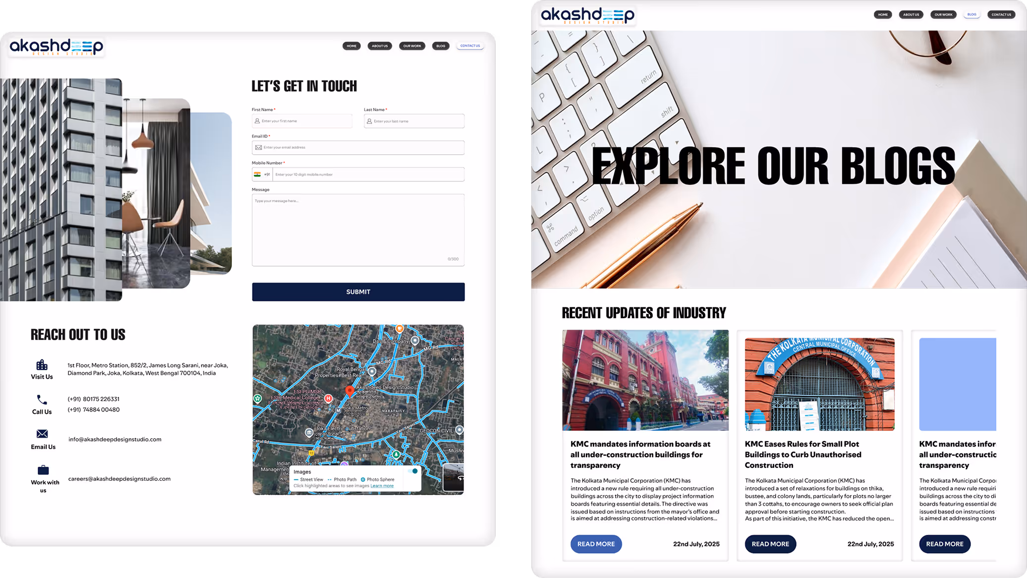
Akashdeep Design Studio is an established architectural and interior design practice known for delivering modern, innovative, and functionally driven spaces. With the next generation taking charge, the brand is expanding into new ventures and required a digital presence that reflects both its long-standing legacy and its forward-thinking approach.
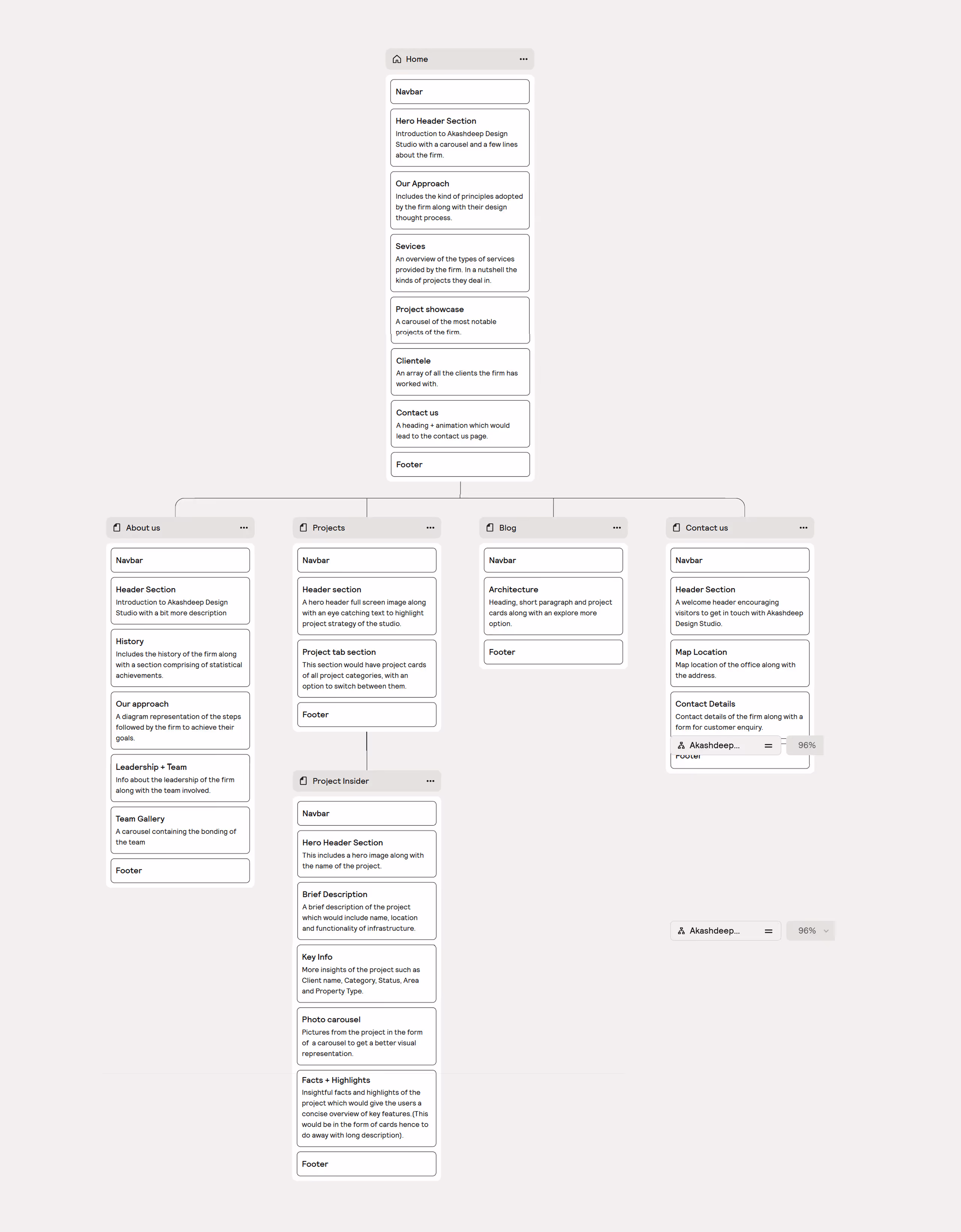
Design Requirements

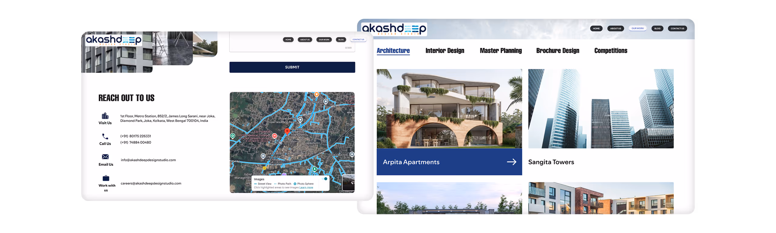
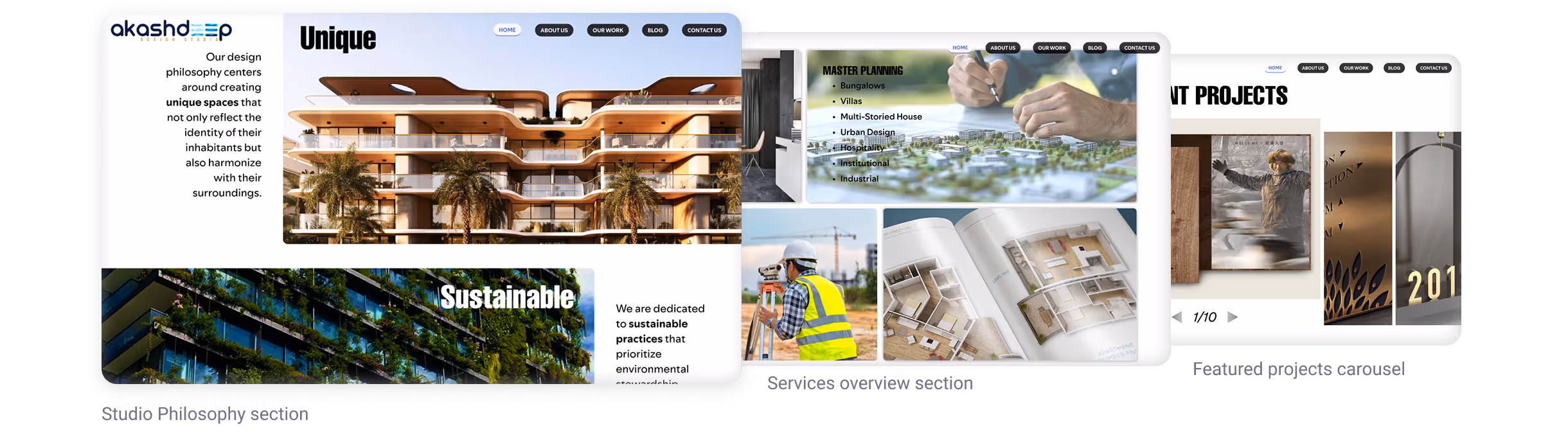
  • Create an elevated, modern, and distinctive digital experience.
  • Build an animation-rich website where each section feels unique and engaging.
  • Develop versatile, innovative layouts that set the brand apart from competitors.
  • Ensure smooth navigation and a user-friendly flow across projects and services.

THE CHALLENGE

goals & objectives

Design Requirements

Redesign and modernize the existing website into a refreshed, high-impact digital presence.

Intuitive navigation

Ensure smooth, intuitive navigation across all pages.

Studio’s craftsmanship

Build an image-led website that visually validates the studio’s craftsmanship and design philosophy.

Animation-driven

Incorporate animation-driven interactions that add personality without compromising usability.

Heritage

Highlight the studio’s heritage-based services while giving equal visibility to newly added offerings.

design approach

ANIMATION

Animation

Adopted an animation-forward approach to create an interactive and engaging user experience throughout the website.

VERSATILE

Versatile

Layouts were intentionally kept clean and understated, yet each section was designed with its own unique structure to maintain interest and variety.

INTUITIVE

Intuitive

Navigation was designed to be minimal, clear, and highly intuitive, ensuring the user always knows where they are and where to go next.

THOUGHTFUL

Thoughtful

Although the experience is visually dynamic, animations were applied thoughtfully to avoid overwhelming or frustrating the user.

INNOVATIVE

Innovative

Instead of relying on traditional, predictable structures, modern and innovative layouts were explored to introduce a fresh, contemporary twist.

information architecture

Akashdeep Design Studio preferred a simple, uncluttered approach to navigation. The goal was to avoid overwhelming users while still allowing them to discover everything the studio offers. A clear and intuitive sitemap was designed that organizes content logically while supporting seamless exploration.

design system

Typography System

Color System

Colors were derived from the client’s existing logo. The primary blue was expanded into a range of supporting tints shades and to create a cohesive palette. Since the client requested minimal color usage, the overall scheme remains neutral and understated, contributing to a professional, modern, and architectural visual tone.

key page breakdown

Home Page

Establish immediate credibility while allowing users to explore the studio’s architectural depth without cognitive overload.

A minimal, structured hero creates instant clarity, supported by simple navigation and subtle animations.

The homepage uses a simple, modern layout with varied structures to sustain visual interest, while a consistent visual language and restrained motion maintain coherence and brand identity.

Psychological Rationale
  • CTA placed at the end to align with commitment readiness.
  • Users engage only after building trust through work and philosophy.
  • Soft color treatment reduces pressure, encouraging action naturally.

The homepage uses a simple, modern layout with varied structures to sustain visual interest, while a consistent visual language and restrained motion maintain coherence and brand identity.

About Us Page

Communicate the studio’s legacy and evolution while maintaining a modern, forward-looking identity.

Set a distinct yet cohesive tone that balances heritage with contemporary practice. Curated imagery introduces an abstract, modern character.

Content progression mirrors the evolution of the studio.

Horizontally structured layout encourages exploration without navigation breaks. Inline profiles maintain flow and reduce page fragmentation. Motion supports discovery while keeping interaction controlled.

Cognitive Load Consideration
  • To balance the richness of content on the page, the “Our Team” and “Team Gallery” sections are intentionally kept simple and restrained.
  • Keeps focus on people while preserving scannability.
  • Positioned to conclude the page on a human note.

An About Us page that respectfully reflects the studio’s heritage while clearly positioning it as a progressive, future-ready practice.

Our Work Page

Present the studio’s complete body of work in a way that feels clear, credible, and effortless to explore.

  • Bold typographic statement reinforces scale and confidence.
  • Projects grouped by service type to reduce search effort.
  • Hover states provide visual preview before selection.

A focused, intuitive portfolio experience that balances visual impact with structure, reinforcing credibility while making project exploration effortless.

Project Insider Page

Provide a focused, in-depth view of individual projects while maintaining clarity and continuity within the broader portfolio.

Breadcrumb menu reinforce hierarchy and allow quick movement across categories. Minimal hero pairs strong imagery with the project name for instant recognition.

Structured metadata supports clarity over narrative density. Information grouped to reduce cognitive load.

Communicate design depth while keeping the experience digestible. Content structured in clear sections to prevent overwhelm.
Navigation Flow Optimization
  • Encourage continued exploration without forcing a return to the main listing.
  • Inline project suggestions support seamless browsing.
  • Keeps users engaged within the portfolio ecosystem.

A project detail experience that balances depth with clarity, allowing users to explore individual works thoroughly without losing navigational context.

animation approach

Animation was treated as a supporting layer rather than a focal point, used to maintain engagement while preserving clarity and restraint across the experience.

Scroll-triggered animations guide content reveal, directing attention naturally and maintaining a smooth, uninterrupted browsing rhythm.

Structured metadata supports clarity over narrative density. Information grouped to reduce cognitive load.

Select an interaction to see how motion is applied across the experience.

Subtle Transitions
Micro-interactions
Hover States
Layout adjustments
Fade-in Effects

Motion remains controlled and purposeful, add responsiveness and feedback where needed. Reinforcing a dynamic yet composed brand presence without overwhelming the user.

RESPONSIVE LAYOUTS

A desktop-first layout system was used, with responsiveness handled through flexible grids and adaptive stacking across breakpoints.
Select sections were refined to preserve hierarchy and clarity across smaller screens.

Final Interface Overview

Secondary pages follow the same visual system, ensuring consistency across the entire experience.

outcomes, learnings & client feedback

The redesigned website establishes a modern, cohesive digital identity aligned with the studio’s architectural practice.

Motion and interaction enhance engagement while maintaining clarity and restraint.

Flexible layouts support diverse content without compromising hierarchy or readability.